Movement

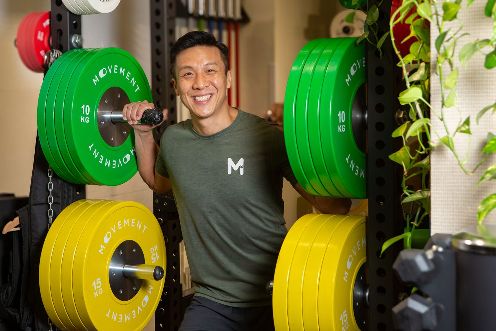
Movement’s visual identity is driven by the belief that everyone has the power to ‘switch on’ and make meaningful changes in their lives.

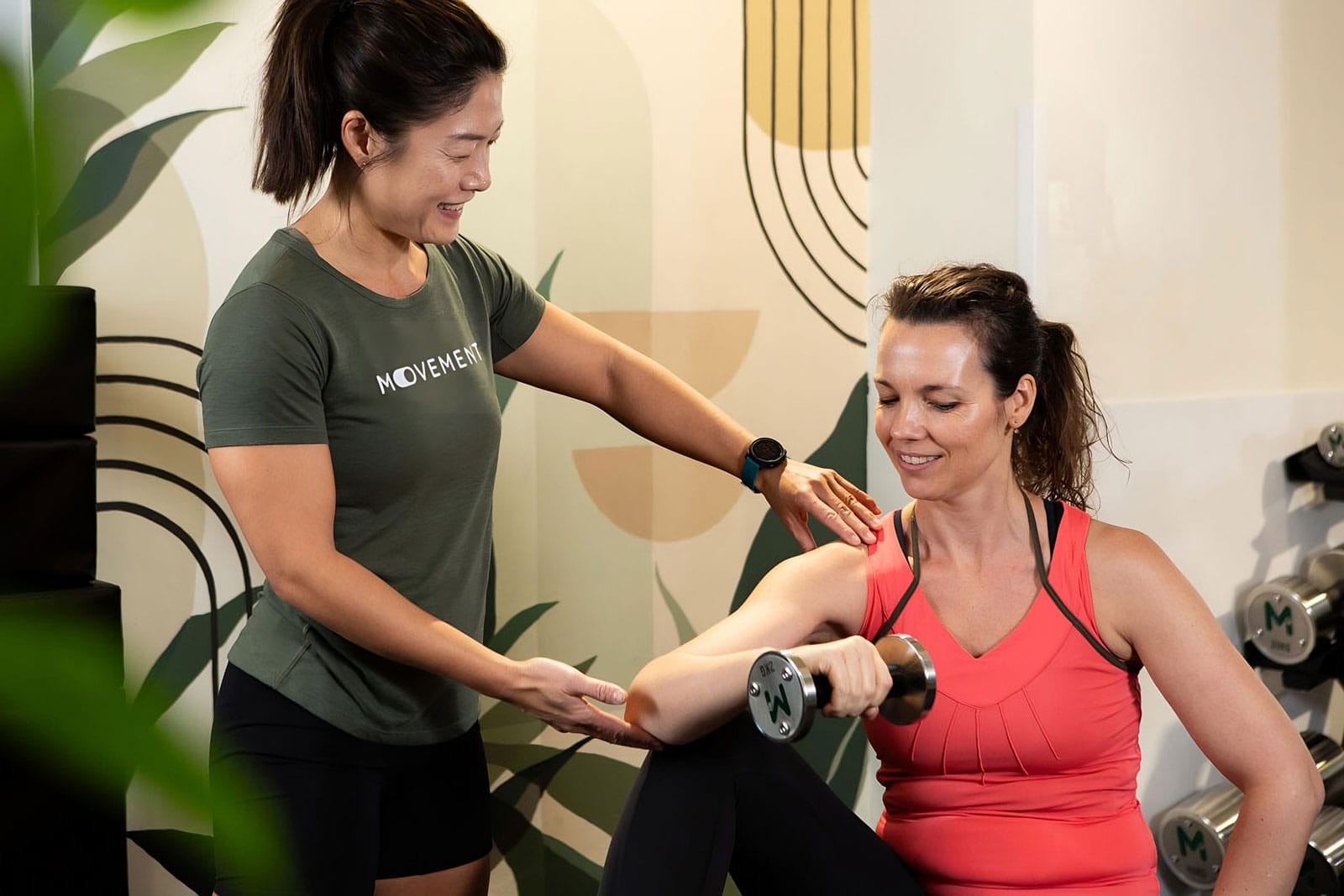
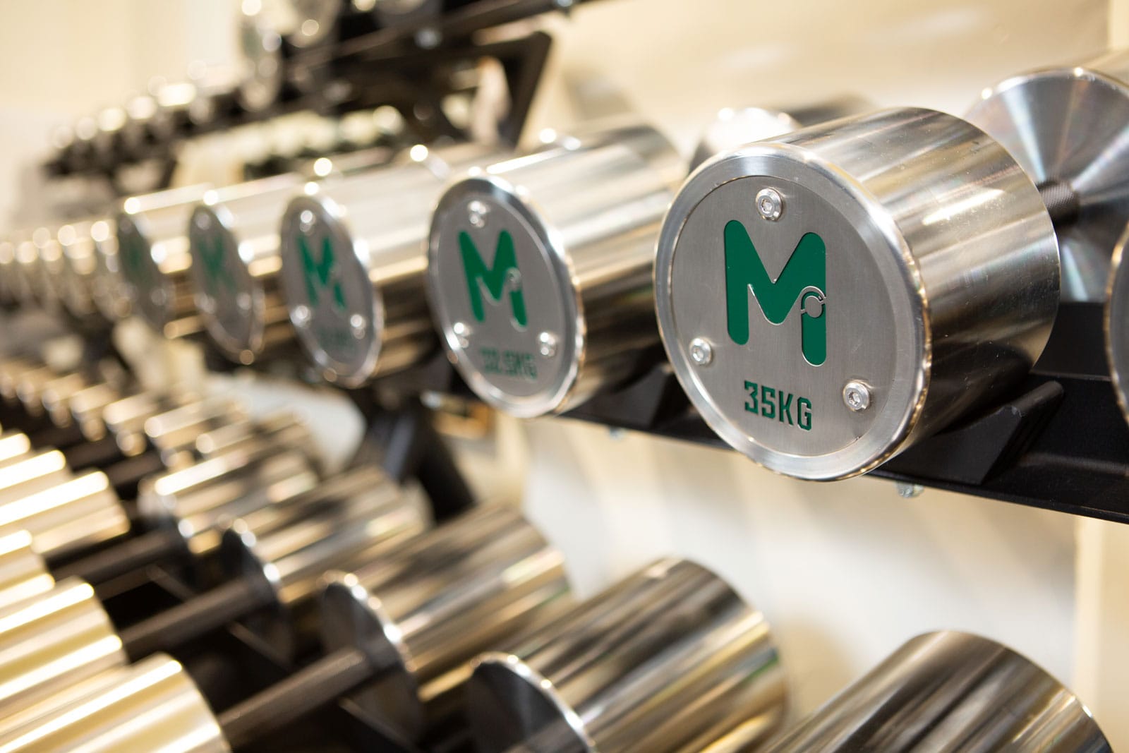
Specialising in personalised training and nutritional coaching, Movement offers a fitness experience that goes beyond conventional gyms. The focus is on empowering individuals through customised care and a holistic approach to fitness, accessible to all.

  • Logotype and Mark
  • Brand Colours
  • Applied branding across the gym
  • Responsive WordPress website
  • Maintenance and Training
The Client

Movement Fitness Gym

More than just a gym, Movement is a vibrant wellness community dedicated to enhancing every aspect of life. Beyond traditional fitness facilities, it offers a supportive, friendly environment that fosters a healthier, more balanced neighbourhood. Committed to uniting like-minded individuals of all ages, Movement makes fitness an integral part of a connected and fulfilling lifestyle.

The Challenge

Crafting a brand identity for a fitness that goes beyond conventional visual elements to capture the essence of the concept

Creating a brand identity for Movement goes beyond mere logo design or colour choices; it involves crafting a visual and emotional representation that truly reflects the organisation’s core values. Unlike conventional fitness aesthetics — often characterised by dark, aggressive imagery and a focus on a predominantly masculine audience — Movement stands out as a vibrant wellness community dedicated to enriching every facet of life.

The brand identity should break away from these traditional norms to embody the empowering belief that everyone has the power to ‘switch on’ and make meaningful changes in their lives. It must capture the supportive, friendly atmosphere that fosters a healthier, more balanced neighbourhood and visually communicate the commitment to uniting like-minded individuals on a transformative journey.

By integrating these elements, the brand identity will resonate with the core values of holistic well-being, interconnectedness, and personal empowerment, making fitness a vital and inclusive part of a fulfilling lifestyle.

The Solution

Crafting a Vibrant Brand Identity: reflecting empowerment and wellness beyond conventional fitness aesthetics

To effectively represent Movement’s distinct approach and ethos, the visual identity was carefully crafted to align with the brand’s core values. The choice of custom rounded sans serif lettering for the logo reflects a modern, approachable character, contrasting sharply with the harsh, aggressive fonts typically used in conventional fitness branding. The rounded shapes of the letters enhance Movement’s friendly and supportive personality, making it inviting to a broader audience.

The logomark was designed with the uppercase “M” and integrates a subtle graphic element inspired by a toggle switch. This design choice symbolises the empowering concept of ‘switching on‘ and making meaningful changes, which is central to Movement’s philosophy. By incorporating this element into both the logo mark and the full logotype, the brand maintains a unified visual identity that reinforces its message of personal transformation and empowerment.

Colour selection plays a crucial role in conveying the brand’s values. The use of a fresh and approachable green hue was deliberate, aiming to evoke feelings of health and vitality rather than the tech-centric tones often seen in modern fitness brands. This choice underscores Movement’s focus on holistic well-being rather than just technological aspects.

Moreover, the brand’s visual identity is designed to resonate in daylight environments, contrasting with the typically dark and intense settings of traditional gyms. This approach ensures that Movement’s imagery engages a wide audience and creates a welcoming atmosphere, further distinguishing it from conventional fitness spaces.


In summary:

  • Rounded Sans Serif: Provides a modern, approachable feel, differing from the aggressive fonts of traditional fitness branding.


  • Logo Mark with Toggle Switch: Symbolises the empowering concept of ‘switching on,’ integrating this idea into the brand’s visual identity.


  • Fresh Green Hue: Conveys health and vitality, shifting away from tech-centric and aggressive masculine colours found in conventional gyms.


  • Daylight Environment: Engages a broader audience and creates a welcoming atmosphere, contrasting with the dark environments typical of conventional gyms.

a project like this in mind?