
Selection of projects featuring a detailed discussion on the challenges encountered and the solutions implemented to achieve client satisfaction.
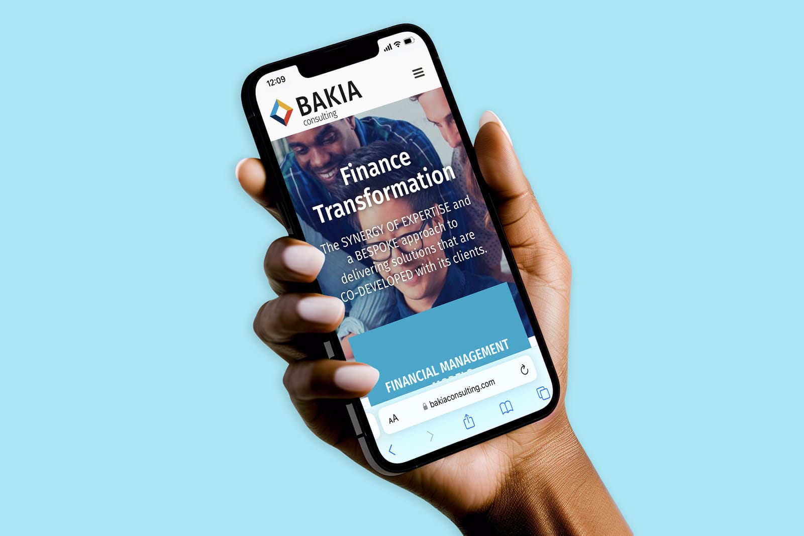
BAKIA provides consulting services centered around four core pillars aimed at transforming the finance function within both private companies and public organisations. Emphasising the importance of people within its methodology, BAKIA manages all finance transformation projects with a dedicated focus on effective change management.
BAKIA recognised the immediate need for a more dynamic brand image. The original brand elements had become dated since the company’s inception, displaying signs of aging and lacking aesthetic rigour. Two critical areas required attention: strengthening the foundational pillars supporting the services and refining the colour palette application.
As specialists in guiding clients through finance transformation with a strong emphasis on effective change management, BAKIA aimed to enhance its impact and project a positive energy to both current and future audiences.
So the challenge lay in effecting brand change seamlessly — taking calculated risks without compromising customer relationships and demonstrating excellence in change management in the process.
In essence, our goal was to drive change smoothly, maintaining public confidence in BAKIA’s ability to lead transformations without disruption.
Redesigning BAKIA Consulting’s brand involved a strategic balance between revitalisation and continuity to ensure a seamless transition. Retaining the essence of the original logo’s four segments and corresponding colour palette was pivotal, honouring BAKIA’s established service pillars.
The primary focus was on refining and strengthening the visual identity. This included simplifying the logo, eliminating unnecessary details. In typography, the choice of a sans serif font was deliberate, conveying a bold and assured personality while evoking a sense of reliability and maturity for the brand.
More than just a gym, Movement is a vibrant wellness community dedicated to enhancing every aspect of life. Beyond traditional fitness facilities, it offers a supportive, friendly environment that fosters a healthier, more balanced neighbourhood. Committed to uniting like-minded individuals of all ages, Movement makes fitness an integral part of a connected and fulfilling lifestyle.
Creating a brand identity for Movement goes beyond mere logo design or colour choices; it involves crafting a visual and emotional representation that truly reflects the organisation’s core values. Unlike conventional fitness aesthetics — often characterised by dark, aggressive imagery and a focus on a predominantly masculine audience — Movement stands out as a vibrant wellness community dedicated to enriching every facet of life.
The brand identity should break away from these traditional norms to embody the empowering belief that everyone has the power to ‘switch on’ and make meaningful changes in their lives. It must capture the supportive, friendly atmosphere that fosters a healthier, more balanced neighbourhood and visually communicate the commitment to uniting like-minded individuals on a transformative journey.
By integrating these elements, the brand identity will resonate with the core values of holistic well-being, interconnectedness, and personal empowerment, making fitness a vital and inclusive part of a fulfilling lifestyle.
To effectively represent Movement’s distinct approach and ethos, the visual identity was carefully crafted to align with the brand’s core values. The choice of custom rounded sans serif lettering for the logo reflects a modern, approachable character, contrasting sharply with the harsh, aggressive fonts typically used in conventional fitness branding. The rounded shapes of the letters enhance Movement’s friendly and supportive personality, making it inviting to a broader audience.
The logomark was designed with the uppercase “M” and integrates a subtle graphic element inspired by a toggle switch. This design choice symbolises the empowering concept of ‘switching on‘ and making meaningful changes, which is central to Movement’s philosophy. By incorporating this element into both the logo mark and the full logotype, the brand maintains a unified visual identity that reinforces its message of personal transformation and empowerment.
Colour selection plays a crucial role in conveying the brand’s values. The use of a fresh and approachable green hue was deliberate, aiming to evoke feelings of health and vitality rather than the tech-centric tones often seen in modern fitness brands. This choice underscores Movement’s focus on holistic well-being rather than just technological aspects.
Moreover, the brand’s visual identity is designed to resonate in daylight environments, contrasting with the typically dark and intense settings of traditional gyms. This approach ensures that Movement’s imagery engages a wide audience and creates a welcoming atmosphere, further distinguishing it from conventional fitness spaces.
In summary:
This self-directed project aimed to enhance my prompting skills and, if successful, compile a selection of these images for upload to Adobe Stock. The goal was to evaluate the requirements and limitations of AI-generated content on stock image platforms.
Designing photorealistic images with Midjourney offered a chance to both explore and challenge the acceptance of AI-generated visuals on platforms like Adobe Stock. By meticulously refining my prompts, I aimed to produce highly detailed and lifelike images while testing how these refined prompts met the specific standards and criteria of stock photo platforms.
This approach allowed me to better understand the requirements and limitations of photo banks and assess the potential of AI-generated content in the stock photo market.
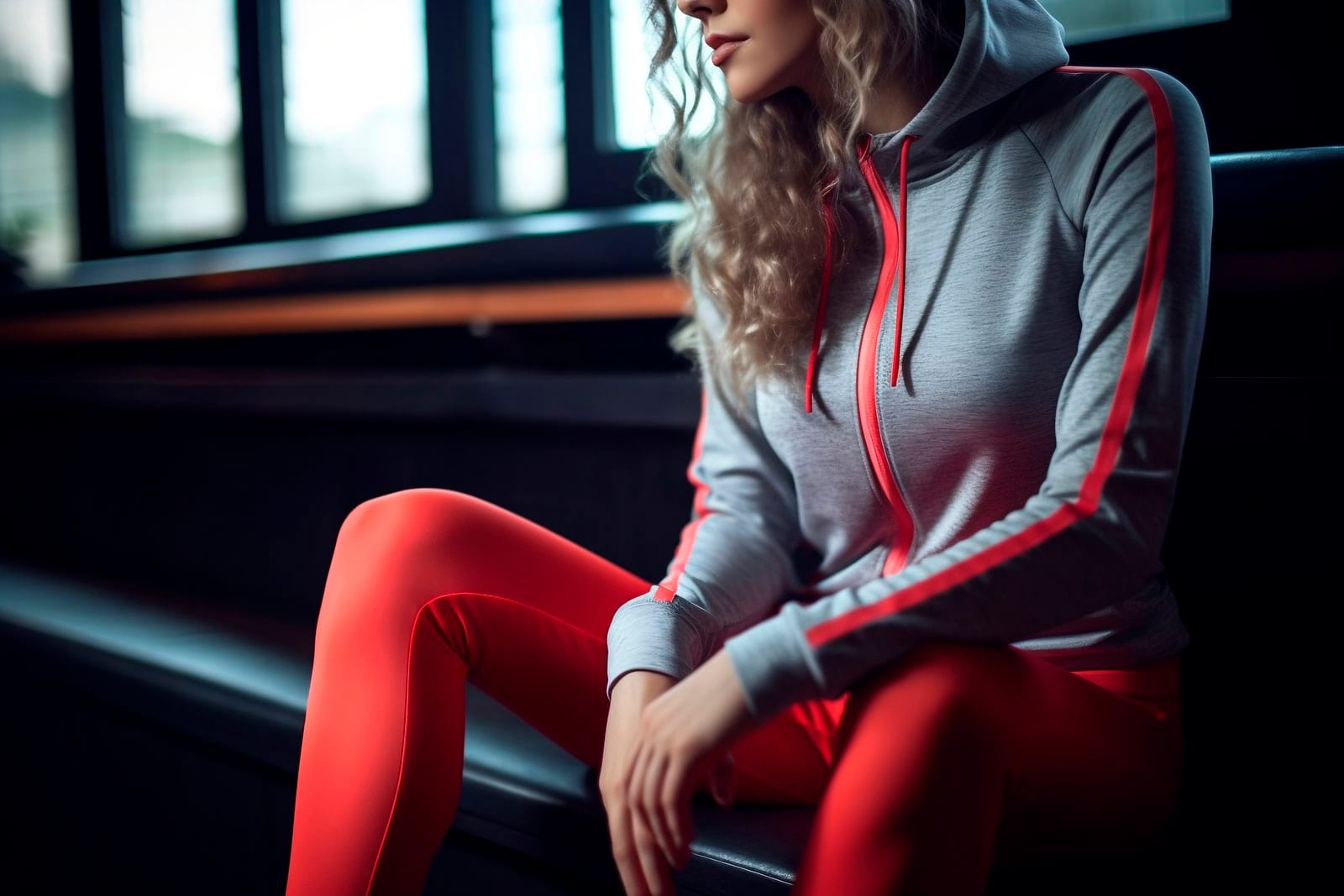
Through this exploration, I identified several effective strategies for optimising AI-generated images for stock photo platforms. A key insight was to avoid rendering faces, which simplified compliance with complex model consent forms required by these platforms. Instead, I focused on creating close-ups that highlight the model’s attire and body movements.
This approach not only adhered to platform requirements but also provided a more compelling presentation of athleisure fashion. By emphasising clothing details and dynamic poses, I enhanced both the visual appeal and relevance of the images within the athleisure category.
The Quantium project exemplifies a successful partnership between creatives to deliver top-tier service for the client. Digital Devotee managed the full brand repositioning for Quantium™, while I contributed my expertise in branding and visual identity.
By working collaboratively in an agile manner, rather than through a centralized approach, we leveraged our individual strengths effectively. This teamwork allowed us to focus on our respective specialties and achieve more efficient progress for Quantium™
The project involved executing a soft rebrand within a compressed timeframe while ensuring a strong triangular relationship between the client, partners and myself. Balancing these elements required navigating tight deadlines and complex stakeholder dynamics to ensure a cohesive and effective rebranding process.
To address these challenges, we adopted a streamlined workflow that emphasised clear communication and agile project management. By coordinating closely with all parties and focusing on our respective strengths, we efficiently delivered a refined brand identity on schedule.
This approach not only met the tight deadlines but also reinforced the collaborative relationships critical to the project’s success.
Senior designer in Hong Kong, specialising in graphic and web design, focusing on crafting impactful visual identities and developing websites for brands to connect with their audiences ➞